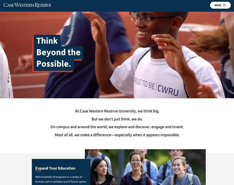
We’re welcoming you back from spring break by freshening up our front door—the virtual one, that is.
Over the weekend, we launched our new university homepage, an update that aims to make case.edu more appealing to the eye—and easier to navigate.
For example, our opening video highlights the beauty and energy of our campus, while the following section points visitors directly to academic program and admission information.
Research, statistics and student testimonials—it’s all there, along with news from The Daily.
As part of the project, we also redesigned primary pages like “about,” admissions” and “campus life.” Just click on “Menu,” and you can visit them all.
Some of the improvements will help raise our profile on search engines, while others aim to make people more likely to engage with our content when they see it. We followed best practices for web writing, and ensured that our website content is available to people of all abilities.
These updates were made with our core audience for the homepage—prospective students—in mind. However, we also reorganized our internal resource pages for students, faculty and staff, and added two for other key audiences: alumni and parents and families. These pages are designed to give you access to the key links you need for your work or studies.
The rest of our site—schools, units and offices—remains the same.
We hope you like the new look, and welcome your feedback.


